Implement a Star Rating Custom Form Element

Implementing a custom form element allows you to augment the existing form elements that come with Geocortex Workflow.

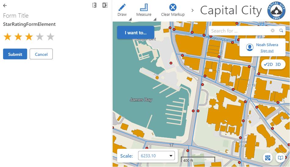
This article will walk you through creating a form element for rating that allows you to select up to five stars.
Prerequisites

Follow the instructions in the Web Applications SDK page to set up your development environment.

note

A working knowledge of TypeScript is recommended before extending Workflow for web-based hosts.

Custom workflow form elements are built in TypeScript and React.

Overview

Implementing a custom form element in Geocortex Mobile consists of three steps:

  1. Creating the custom form element and implementing the UI.
  2. Creating an activity which will register this form component with Geocortex Workflow.
  3. Registering the activity with Geocortex Workflow and running it before using the custom form element.

Set up the Custom Form Element Skeleton

  1. Create a new file StarRatingElement.tsx in the activity SDK.
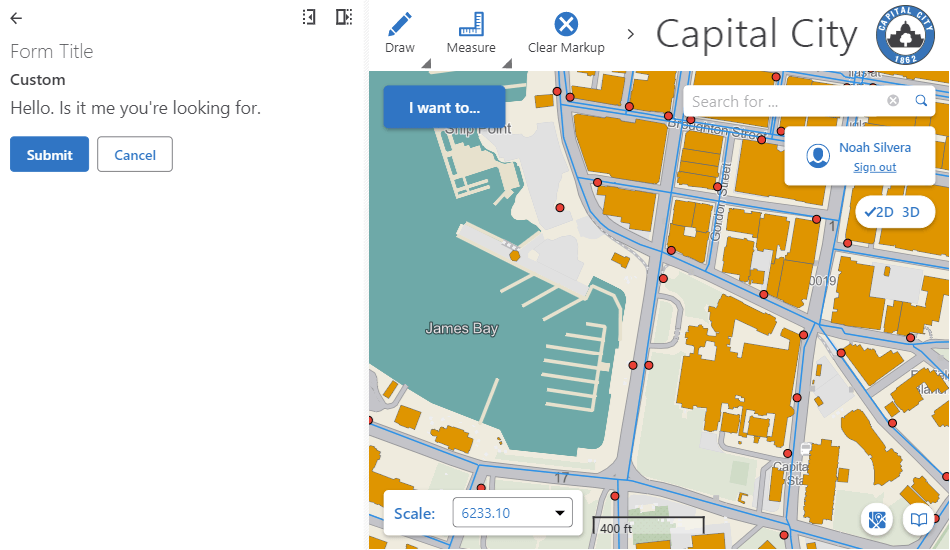
  2. Create a skeleton React form element.
src/form-elements/StarRatingElement.tsx
import * as React from "react";
import { CustomFormElementProps } from "@geocortex/workflow/runtime/app/RegisterCustomFormElementBase";
function StarRatingElement(props: CustomFormElementProps) {
return <div>Hello. Is it me you're looking for.</div>;
}
export default StarRatingElement;

Set up a Form Element Registration Activity

  1. Run the command npm run activity and name the activity RegisterCustomFormElements.
  2. Modify the activity class declaration to extend the RegisterCustomFormElementBase base class.
  3. Remove unnecessary inputs and outputs and register your custom form element in the execute method.
src/activities/CustomFormElementRegistration.tsx
import { RegisterCustomFormElementBase } from "@geocortex/workflow/runtime/app/RegisterCustomFormElementBase";
import StarRatingElement from "../form-elements/StarRatingElement";
// @category Custom Activities
// @description Registers custom form elements for the application
export class RegisterCustomFormElements extends RegisterCustomFormElementBase {
static action = "your:unique:namespace::RegisterCustomFormElements";
static suite = "your:unique:namespace";
async execute(): Promise<void> {
this.register("StarRatingElement", StarRatingElement);
return;
}
}

Build the Star Rating UI

Next, we are going to build the form element to display the five stars the user can select. Form Elements are just React elements, and use React patterns to define their UI.

First, let's build the star DOM elements.

src/form-elements/StarRatingElement.tsx
import * as React from "react";
import { useState, useEffect } from "react";
import { CustomFormElementProps } from "@geocortex/workflow/runtime/app/RegisterCustomFormElementBase";
export default function StarRatingFormElement(props: CustomFormElementProps) {
const rating = 5;
// Button style to show only the button content.
const baseStyle: React.CSSProperties = {
background: "none",
border: "none",
outline: "none",
fontSize: "2em",
padding: 0,
};
// Button styles to show selected and unselected states.
const selectedStyle = { ...baseStyle, ...{ color: "#ffa91b" } };
const unselectedStyle = { ...baseStyle, ...{ color: "#c6c6c6" } };
// Create 5 buttons
const buttons = [];
for (let i = 1; i <= 5; i++) {
buttons.push(
<button
value={i}
style={rating < i ? unselectedStyle : selectedStyle}
>
</button>
);
}
return <div>{buttons}</div>;
}

Add Interactivity

Next, we are going to add interactivity to the form element to show how many stars the user has selected.

src/form-elements/StarRatingElement.tsx
import * as React from "react";
import { useState, useEffect } from "react";
import { CustomFormElementProps } from "@geocortex/workflow/runtime/app/RegisterCustomFormElementBase";
export default function StarRatingFormElement(props: CustomFormElementProps) {
let [rating, setRating] = useState(0);
const handleClick = (event) => {
// Get the value from the button.
// Parse as an integer because the value will be a string.
const value = parseInt(event.target.value);
if (rating !== value) {
// Update the component state.
setRating(value);
}
};
// Button style to show only the button content.
const baseStyle: React.CSSProperties = {
background: "none",
border: "none",
outline: "none",
fontSize: "2em",
padding: 0,
};
// Button styles to show selected and unselected states.
const selectedStyle = { ...baseStyle, ...{ color: "#ffa91b" } };
const unselectedStyle = { ...baseStyle, ...{ color: "#c6c6c6" } };
// Create 5 buttons
const buttons = [];
for (let i = 1; i <= 5; i++) {
buttons.push(
<button
onClick={handleClick}
value={i}
style={rating < i ? unselectedStyle : selectedStyle}
>
</button>
);
}
return <div>{buttons}</div>;
}

Expose the Form Elements Value

Finally, we are going to expose the form elements value to the larger workflow. For more information on this, check out the form element reference.

src/form-elements/StarRatingElement.tsx
import * as React from "react";
import { useState, useEffect } from "react";
import { CustomFormElementProps } from "@geocortex/workflow/runtime/app/RegisterCustomFormElementBase";
export default function StarRatingFormElement(props: CustomFormElementProps) {
// Set the default state of the component.
let [rating, setRating] = useState(0);
useEffect(() => {
const { element } = props;
if (element.value === undefined) {
element.value = 0;
}
// Set the state from the element's value when the props change.
// This could happen as the result of a form event subworkflow that uses
// the "Set Form Element Property" activity to set the value property of
// the element.
if (element.value !== undefined && element.value != rating) {
setRating(element.value);
}
}, [props.element.value]);
const handleClick = (event) => {
const { element, raiseEvent } = props;
// Get the value from the button.
// Parse as an integer because the value will be a string.
const value = parseInt(event.target.value);
if (rating !== value) {
// Update the component state.
setRating(value);
// Update the element's value.
element.value = value;
// Raise the changed event
raiseEvent("changed", value);
}
};
// Button style to show only the button content.
const baseStyle: React.CSSProperties = {
background: "none",
border: "none",
outline: "none",
fontSize: "2em",
padding: 0,
};
// Button styles to show selected and unselected states.
const selectedStyle = { ...baseStyle, ...{ color: "#ffa91b" } };
const unselectedStyle = { ...baseStyle, ...{ color: "#c6c6c6" } };
// Create 5 buttons
const buttons = [];
for (let i = 1; i <= 5; i++) {
buttons.push(
<button
onClick={handleClick}
value={i}
style={rating < i ? unselectedStyle : selectedStyle}
disabled={disabled}
>
</button>
);
}
return <div>{buttons}</div>;
}

Deploy the Activity

Follow the instructions to build the activity pack and deploy it.

Test the Activity

Once your activity pack is hosted and registered, your custom activity should appear in the activity toolbox in Geocortex Workflow Designer alongside the built-in activities, and can be used in the graphical interface like any other activity.

Now you can build a workflow that uses your new custom form element! It is essential that the register form elements custom activity be run before the custom form element is used, and for that reason, it is best practice to run the form element registration activity at the start of a workflow.

note

You can download this demo workflow that registers and displays the custom form element and then import it into the Geocortex Workflow Designer. You will have to deploy the custom activity and form element for it to function. This workflow assumes you are hosting the activity pack with the dev server on https://localhost:57999/.